The Flatten the Curve infographic is the defining image of the pandemic, and it offers an excellent example of the value of design. Understanding how this is an effective design tool can open up new opportunities for use in other parts of life and business. However, the value and purpose of design continue to be a confusing topic. So, when an instance like the Flatten the Curve graphic comes up, it presents an excellent opportunity to talk about the value of design.
First, we need to understand; What is design?
There are many definitions for design, but they are too general or outdated. It’s essential to understand what design has evolved into. Through this, we can better see its value to creating human experiences and business strategy. Design is a problem-solving process that creates an engagement system that inspires a new behavior or comprehension that promotes improvement for people or business objectives. Good design accomplishes this through an intentional experience that focuses on the user’s needs. This could be a lifestyle improvement through product design, a user experience on a website, or even marketing and revenue growth through strategic design.
What makes design such a confusing subject is because it’s both a noun and a verb. If “design” is a noun, it’s the thing that designers make, an object. If “design” is a verb, then it’s the thing that designers do; it’s a process. The noun creates and visualizes a product while design the verb is a creative and strategic process. Designers are experts in facilitating human experiences, and a successful design is one that brings both the noun and verb together using a creative problem-solving process. Creativity is a critical part of the process of finding connections between elements that will build human-centered solutions and business strategy.

An example of everyday design that we interact with is a car interior. BMW or a Jeep wants you to feel a certain way when you sit in one of their cars. This provides an environment that communicates their brand message and business strategy. The distinct differences between each of the experiences are designed to make the driver feel and behave a certain way. Both examples present a brand design message with a functional purpose that’s specific to the model. These bring together both the noun and the verb of design.

The impact of COVID-19
The initial reaction to the COVID-19 virus in the US exposed all the gaps and challenges in the way we learn and communicate. Mass hysteria, frustration, negativity, and incomplete and misinformation permeated social media and news outlets. What’s real, what’s fake, and how should we feel? It’s become too easy to get “information” from social media headlines and memes. These illicit quick and strong emotional responses, but easily send people down the path of negativity or unconstructive responses and behaviors.
We have been re-wired to forget that we’re all working towards a bigger picture or goal. We’ve lost sight of the context. The algorithms behind how we learn and communicate only show us the bits that we’re supposed to see. With context and understanding of the higher purpose removed, individual interpretation drive polarized conversations toward group think failure.
Memes and more memes
The reaction and subsequent bewilderment over toilet paper are a perfect example of where it’s all gone wrong. Memes about hoarding toilet paper flooded social media. Memes are the perfect example of how effective a simple visual story can influence thought, spur action, or create a change in behavior. Through all the meme posts, one visual piece appeared that would change the COVID-19 conversation.
The value of stories
We needed a way to get people to understand the importance of social distancing to slow the spread of COVID-19 and to avoid overburdening the healthcare system, and this was the Flatten the Curve image. The graphic had a profound effect on the way we discussed and learned how to mitigate and manage the spread of COVID-19. The graphic visualized the inaction and action scenarios in a simple visual format, but also shared the context of the situation. The image presented a comparison between inaction and action and allowed people to understand the directive and outcome.
The Flatten the Curve meme shared a story of inaction vs. action that connects to our need for optimism and safety. This was all accomplished through a visual narrative that enhanced the understanding of the bigger context. This story had an immediate and powerful connection to people within the context of the pandemic.
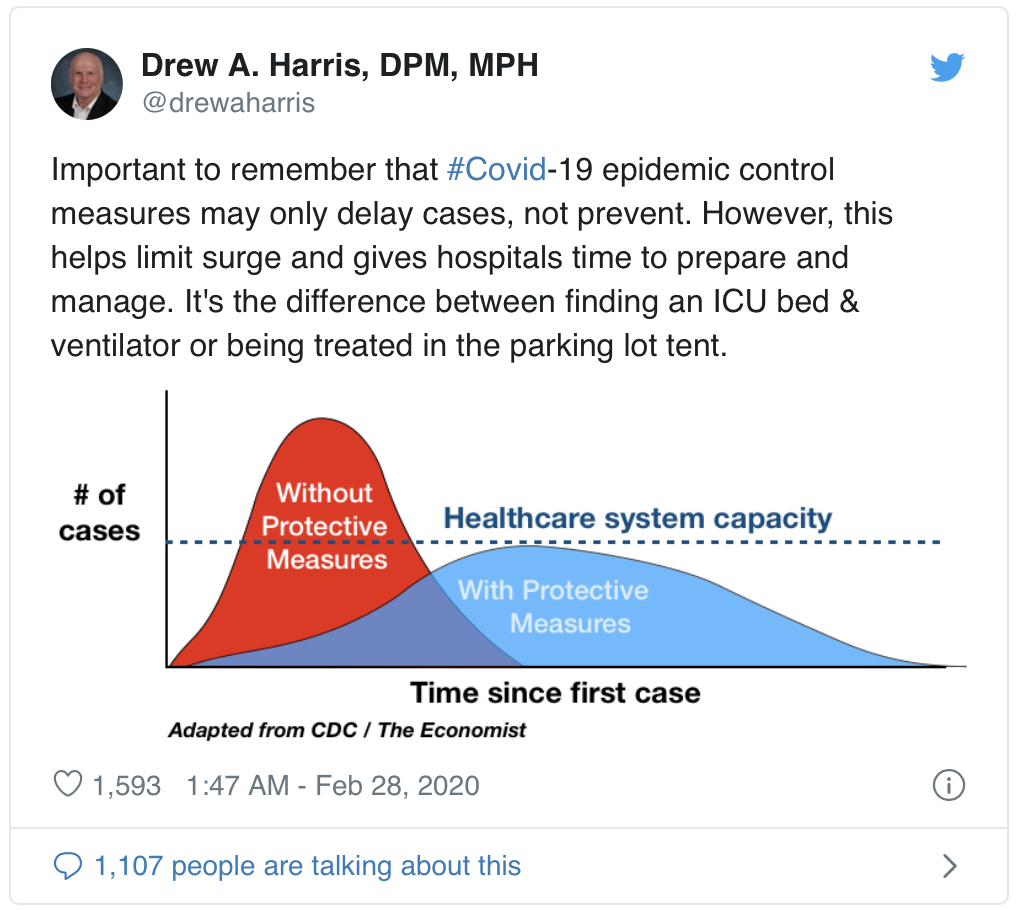
COVID-19 created a rapidly evolving environment, where news and information changed so quickly that it was difficult for people to keep pace. It became imperative to focus the conversation that would help drive the next steps. The infographic has existed for several years, but most recently appeared in the Economist. This inspired Dr. Drew Harris, a population health analyst and Assistant Professor and Jefferson College of Population Health, to redraw it and promote it through social media. The graphic, which started as a simple epidemiological tool to present the importance of managing the surge of patients at hospitals, became a powerful tool.

The New York Times, May 3, 2020
The graphic presented itself as both a noun and a verb. The visualization of the relationship between the curves is the design as a noun part. It was also able to mobilize action through the story it told. With the addition of data to the graph, it became a tool for future presentations of information. This is how it acts as a verb. Most importantly, the infographic’s story and purpose were able to connect to people through a relevant communication or messaging medium.
Since many of us are confined to our homes right now, we can look around for other well-designed experiences. Look around for products, physical or digital that share a story, inspire action, and provides an improvement for the user and the brand. Identify the problems that they solve and the benefits they offer. This could be a well-designed mixer or cooking pot, a TV remote, or a website that you frequent. A smart thermostat or doorbell are examples of good design as well. Lego used the design system to create a business strategy that connects entertainment and education. The best designs are the ones that are so good that they are invisible to the user. They create seamless, meaningful connections and benefits to the user.
Further reading
The story behind ‘flatten the curve,’ the defining chart of the coronavirus
Flattening the Coronavirus Curve
Flattening the coronavirus curve goes way beyond science | Expert Opinion